Compelling Composition: A Six-Pass Framework for Food Images That Sell
Use focal hierarchy, visual flow, emotional geometry, and a six-pass audit to create food and beverage images with clear commercial purpose.
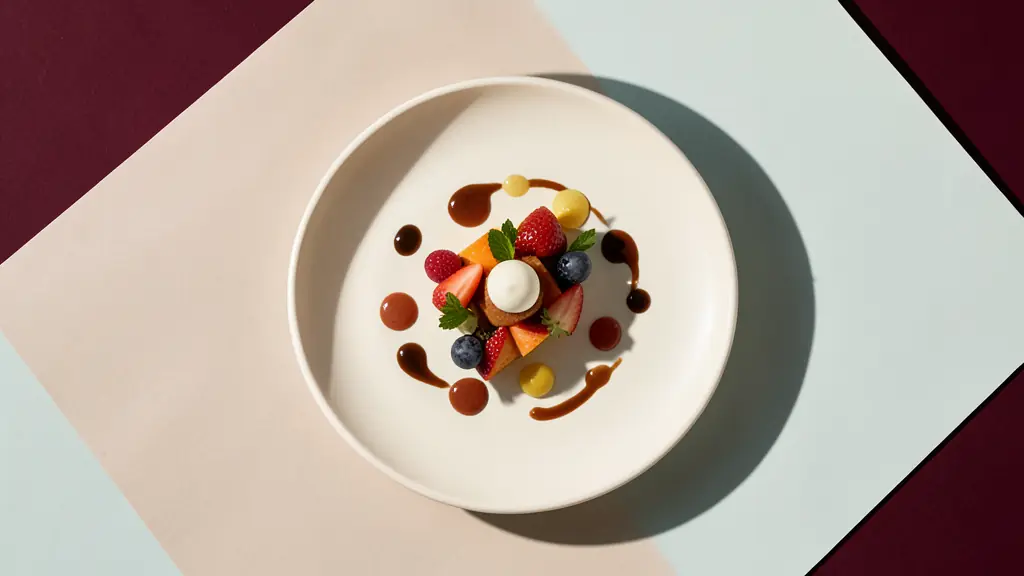
Compelling composition is an intentional path from the first point of attention to a clear emotional or commercial message. Identify one dominant appetite cue, remove its strongest competitor, and audit the result at thumbnail size. No grid guarantees success, but a purpose-driven visual arrangement makes freshness, indulgence, precision, or abundance immediately legible.
No time to read?
- A compelling composition gives the eye one unmistakable place to begin and a purposeful route through the frame.
- Hierarchy, contrast, visual flow, color, edges, balance, and negative space matter more than mechanical compliance with a grid.
- Composition changes emotional meaning: the same product can feel luxurious, energetic, intimate, abundant, or restrained.
- Rules are useful diagnostic tools, but the final arrangement must serve the image’s message, placement, and commercial job.
A Compelling Frame Makes One Visual Promise
A compelling composition is the purposeful arrangement of subject, space, color, light, and detail around one dominant idea. In food photography composition, that idea should translate into a sensory or emotional promise: the crispness of fried chicken, the chill of a cocktail, the generosity of a shared table, or the precision of a tasting menu.
Composition design determines what the viewer notices, in what order, and with what emotional impact. The focal point attracts attention. Supporting elements provide context. Background details establish atmosphere without demanding equal consideration. Together, these decisions create visual flow and turn static images into directed experiences.
This is why composition matters commercially. A beautiful frame can still fail if the viewer sees an ornate prop before the product or reads restraint where the brand needs abundance. Strong creative communication does not merely show what a dish looked like. It makes the intended response easy to feel.
Before placing a plate, glass, napkin, or utensil, finish this sentence: “This image must make the viewer want to experience…” The answer becomes the visual promise. Every subsequent choice must reinforce it, clarify it, or leave the frame.
Start With the Appetite Cue, Then Rank Everything Else
Build the frame around the sensory evidence most likely to trigger desire. This might be a glistening cut edge, a ribbon of sauce, rising steam, condensation on glass, a bright cocktail garnish, or the textured interior of freshly broken bread. Choose one cue that must register first.
Next, establish a three-level visual hierarchy:
- The primary element delivers the appetite cue and identifies what the image sells.
- Supporting elements deepen flavor, setting, or brand character.
- Background elements create atmosphere and separation.
Control that hierarchy through scale, placement, contrast, depth of field, and selective styling. A larger foreground garnish can overpower the drink it is supposed to support. A highly reflective fork may become more noticeable than a delicately lit entrée. A vivid napkin can redirect attention away from a restrained farm-to-table plate.
The remedy is not always removal. Reduce the prop’s scale, lower its contrast, soften it through focus, move it toward the edge, or turn its brightest surface away from the key light. Product distinction should remain strongest where appetite and identity intersect.
Styling must also anticipate the camera rather than treating the finished plate as untouchable. A disciplined camera-ready food styling workflow coordinates portioning, surface texture, garnish direction, and camera angle before fragile cues begin to deteriorate.
Review the first frame without asking whether it is attractive. Ask what wins. If the answer is the linen, tableware, or decoration rather than the food or beverage, the hierarchy is misassigned.
Control the Eye With Contrast, Lines, Edges, and Space
The most useful composition principles operate as cause-and-effect tools. They are valuable because they predict how specific visual decisions can influence recognition, movement, and clarity.
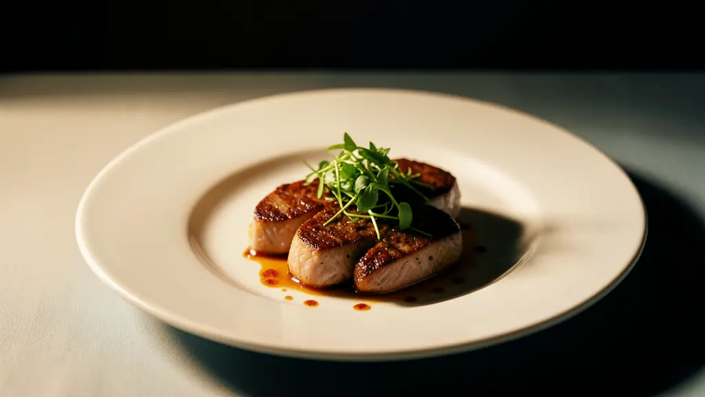
Value contrast produces immediate separation. A pale dessert against a similarly pale surface may feel refined at full size but disappear in a delivery thumbnail. A controlled shadow, darker plate, or carefully positioned highlight can establish the silhouette without changing the dish.
Leading lines create movement. Cutlery, table edges, pours, herb stems, and repeated plates can guide attention toward the product. Repeated circular forms can connect glassware to bowls, while an S-curve formed by sauce, ingredients, or table placement creates a slower, more sensuous route. Dynamic symmetry can help organize multiple elements when a simple grid feels too rigid, but its geometry should support the story rather than become the story.
Framing provides containment. A doorway, shelf, tray, pair of hands, or foreground glass can enclose the subject and intensify viewer engagement. Edge control then determines whether that enclosure feels deliberate. Bright fragments at the border pull the eye outward. Awkwardly clipped garnishes appear accidental. A purposeful crop can create immediacy, but an unresolved edge leaks attention.
Color contrast separates the hero while expressing brand character. Balance gives the arrangement stability, even when the two sides are not visually identical. Negative space provides breathing room and gives menu copy, campaign headlines, or interface elements somewhere to live.
Compare two treatments of the same cocktail. In a static frame, the glass sits centrally, the garnish stands upright, and every surrounding object rests parallel to the image edges. Recognition is clear, but the eye has nowhere to travel. In a directed frame, a diagonal bar spoon enters from a lower corner, a curved peel points toward the illuminated rim, and a secondary glass fades into the background. The product remains dominant, but the visual route introduces anticipation.
Use “fill the frame” when texture and indulgence are the message. Use space when restraint, exclusivity, or copy placement matters more. Neither approach is inherently stronger. Its value depends on placement and intent.

Geometry Changes the Emotional Flavor
Arrangement does more than organize information. It changes the emotional flavor of what is being sold.
Symmetry suggests ceremony, control, and luxury, particularly when glassware, plate geometry, and light are equally disciplined. Asymmetry introduces energy and informality. Diagonals imply action, making a pour, slice, or shared table feel active. Centered framing can make a signature dish iconic. Generous negative space communicates restraint, while dense layering can suggest abundance.
The same plated entrée can therefore support very different storytelling. Place it on weathered wood, allow ingredients to drift outward, use warm directional light, and crop with slight irregularity to create a rustic impression. Surround it with raised glassware, saturated accents, and diagonal gestures to make it celebratory. Move closer, darken the perimeter, and isolate a cut surface for intimacy. Increase spacing, cool the color weight, harden the light, and align every object precisely, and the image may become clinical.
These choices create emotional food imagery only when they are coordinated. Warm color alone cannot create intimacy if the camera angle feels distant. Symmetry cannot signal luxury if clutter disrupts the edges. A dramatic crop cannot create excitement if the focal cue remains visually weak.
The geometry should embody the artistic intent. Before adjusting the plate, name the desired emotional quality, then align spacing, angle, cropping, color weight, and directional light around it.
Use Composition Rules as Tests, Not Laws
Composition guidelines are diagnostic options, not hard and fast laws. Each convention solves a particular visual problem, and each can become limiting when applied without regard for product, placement, or concept.
The rule of thirds helps move a focal point away from a passive center and can reserve usable space for copy. Odd-number grouping prevents supporting objects from forming overly obvious pairs. Leading lines establish direction. Frames within frames concentrate attention. Visual triangles connect three important areas and can stabilize a tabletop arrangement with several products.
Use these composition techniques as tests:
- If the image feels static, move the focal point toward a third or introduce a diagonal.
- If scattered elements feel unrelated, organize them into a triangle or repeated curve.
- If the eye escapes through the background, strengthen an internal frame.
- If multiple objects carry equal weight, change their scale, spacing, or contrast.
- If a mobile crop feels empty, fill the frame more decisively.
Breaking convention is equally legitimate. A centered bottle can feel iconic because its symmetry communicates authority. A cropped vessel may imply proximity and scale. Deliberate imbalance can produce tension appropriate to an avant-garde campaign. A garnish touching the edge may create momentum rather than appear careless, provided its direction returns attention to the product.
In commercial food photography, the decisive question is not whether the photographer followed recognized design principles. It is whether the choice makes the product, mood, and intended action easier to understand.
This distinction separates purposeful experimentation from random disruption. When a convention is broken, hierarchy must remain legible and the reason must be defensible. “It felt more interesting” is weak justification. “The centered framing made the bottle feel collectible while preserving clear label recognition” connects technique, perception, and commercial purpose.
One Intent, Two Different Kinds of Control
Painting and photography share composition concepts, but their methods of control are not interchangeable. A painter can invent, move, enlarge, simplify, or reshape any element. A photographer begins with physical subjects and must control what enters the frame through selection, camera position, lens perspective, styling, light, timing, and exclusion.
| Decision | Painting | Photography |
|---|---|---|
| Focal control | The artist can invent or exaggerate light, color, scale, and detail | The photographer controls lighting, focus, placement, exposure, styling, and timing |
| Edge treatment | Forms can be softened, sharpened, extended, or omitted at will | Edges depend on light, depth of field, surface contrast, lens behavior, and retouching |
| Perspective | Space can be constructed or intentionally distorted | Perspective is primarily governed by camera position and subject distance, with framing affected by lens choice |
| Revision options | Elements can be repainted, moved, resized, or removed | Physical changes require restyling or reshooting, while some refinements can be handled in post-production |
| Common failure mode | Invented elements may weaken coherence or spatial credibility | Uncontrolled reflections, props, crops, and background details may compete with the product |
Painterly thinking remains useful when translated into camera decisions. Instead of painting a brighter highlight onto a cocktail, reposition the light or rotate the glass until the highlight defines its curve. Instead of enlarging a berry to strengthen color weight, move it closer to the lens, alter the camera angle, or simplify nearby elements. Instead of softening a distracting edge with a brush, reduce its contrast through flagging, focus, surface choice, or selective post-production.
A great painting can direct attention without obeying physical reality. Photography must negotiate reality before refining it. That constraint is commercially useful because it forces precise decisions about what the viewer should believe, desire, and remember.
Critique culture sometimes collapses both disciplines into abstract judgments about balance or beauty. A business image needs a narrower test. It must preserve aesthetic coherence while identifying the product, expressing the intended positioning, and surviving its final placement. The relevant question is not whether the frame appears painterly. It is whether painterly control has been converted into repeatable photographic choices.
The Six-Pass Audit: Diagnose Before You Decorate
Use this audit after the initial setup and again during editing. Change only one variable between comparison frames whenever possible. That discipline reveals whether the improvement came from camera position, styling, light, crop, or removal rather than from an unrepeatable combination of adjustments.
Before shooting, connect the image to its destination. A menu thumbnail, social post, delivery listing, print advertisement, and wide website banner impose different cropping and viewing conditions. Planning imagery around a commercial objective prevents an elegant studio frame from failing when it enters the marketing funnel.
-
Pass 1, state the intended response. Write one concise phrase such as “cold and sparkling,” “rich and indulgent,” “precise and premium,” or “abundant and social.” Avoid combining incompatible ambitions. The response becomes the standard against which every element is judged.
-
Pass 2, identify the first focal point. Look away, return to the frame, and note what registers first. It should be a product-defining appetite cue, not merely the brightest object. If attention lands on a prop, reflection, napkin, or background highlight, reduce that competitor before adding decoration.
-
Pass 3, trace the eye path. Follow what happens after the first fixation. Leading lines, repeated shapes, an S-curve, directional garnish, and changes in focus can move attention through the image. The path should deepen understanding and return attention to the hero rather than deposit the viewer at an empty edge.
-
Pass 4, inspect competing contrast. Examine brightness, saturation, sharpness, scale, texture, and color temperature. Competition can come from a tiny highlight as easily as from a large object. Check the perimeter for bright fragments, sharp corners, cropped utensils, and reflections that interrupt visual flow.
-
Pass 5, test the real placements. Reduce the image to thumbnail size and inspect channel-specific crops. Confirm that the focal cue remains recognizable on a small screen, that essential product information survives vertical and horizontal versions, and that negative space still supports any planned copy. There is no universal quality score or single composition method that outperforms every other method. Success depends on whether the intended message remains clear in the actual commercial context.
-
Pass 6, remove or reposition one nonessential element. Do not decorate automatically to cure emptiness. Remove one herb, glass, utensil, plate, or background object, then compare the frames. If the story becomes clearer, the element was decorative noise. If mood or context disappears, restore it or give it a quieter supporting role.
Critique should also produce actionable evidence. Do not ask viewers only whether they like the image. Preference can be sincere but diagnostically useless. Show the frame briefly, then ask:
- Where did you look first?
- What did you feel?
- What does the image appear to sell?
- Where did your eye go next?
- Which element felt unnecessary or confusing?
Compare those answers with the stated intent. If viewers identify the correct product but describe the wrong emotion, revise geometry, spacing, color, or light. If they feel the intended emotion but cannot identify what is being sold, strengthen the focal cue. If attention divides between two elements, lower the contrast of the secondary one before increasing the hero’s intensity.
Stop refining when the focal cue remains immediate at thumbnail size, the supporting elements deepen rather than divide the story, and every departure from convention has a defensible purpose. Otherwise, change one variable at a time and compare the resulting frames.
Envie d'aller plus loin ?
Laisse ton email, on te prévient dès qu'un nouvel article sort.